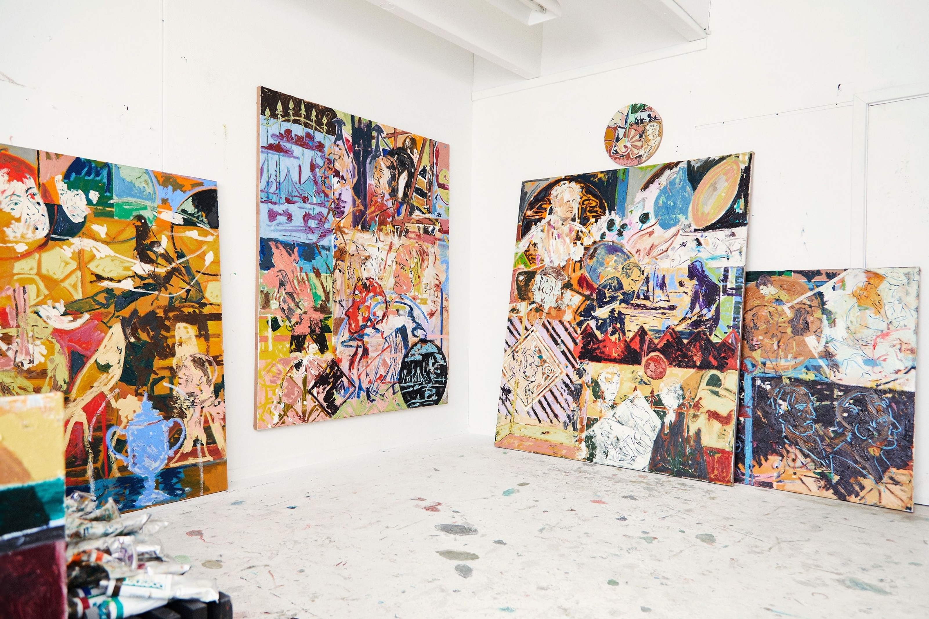
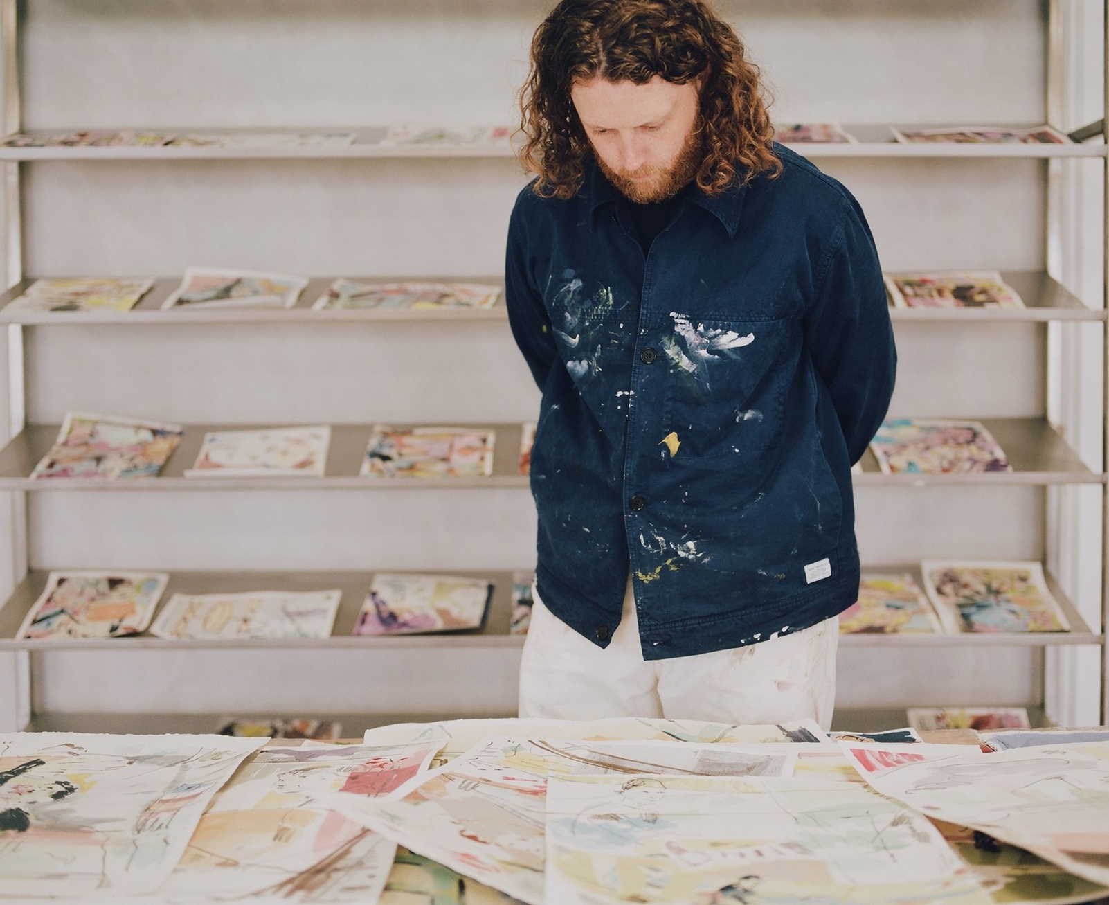
The kaleidoscopic paintings of the British born artist, now based in Copenhagen, “reinvent” themselves for an exclusive collaboration with the Scandinavian brand, adding a splash of colour to the fashion trends of this season
Founded in Nørrebro, one of the most multicultural and trendiest districts of the Danish capital, back in 2002, Wood Wood is a contemporary fashion and lifestyle brand conceptualised by co-founders Karl-Oskar Olsen and Brian SS Jensen. Having shaped itself around the urban culture-inspired atmosphere of the ’90s, the brand encapsulates influences coming from worlds as diverse as sports, art, and music, and reinterprets them through streetwear while always keeping an eye on youth’s refreshing contribution to society.
Quoting the founders’ own words, Wood Wood’s vision is best described as the balanced combination of “expression and function:” two complementary principles useful to preserve the label’s stylistic authenticity against the monotony of fast fashion and guarantee the highest standards of wearability.
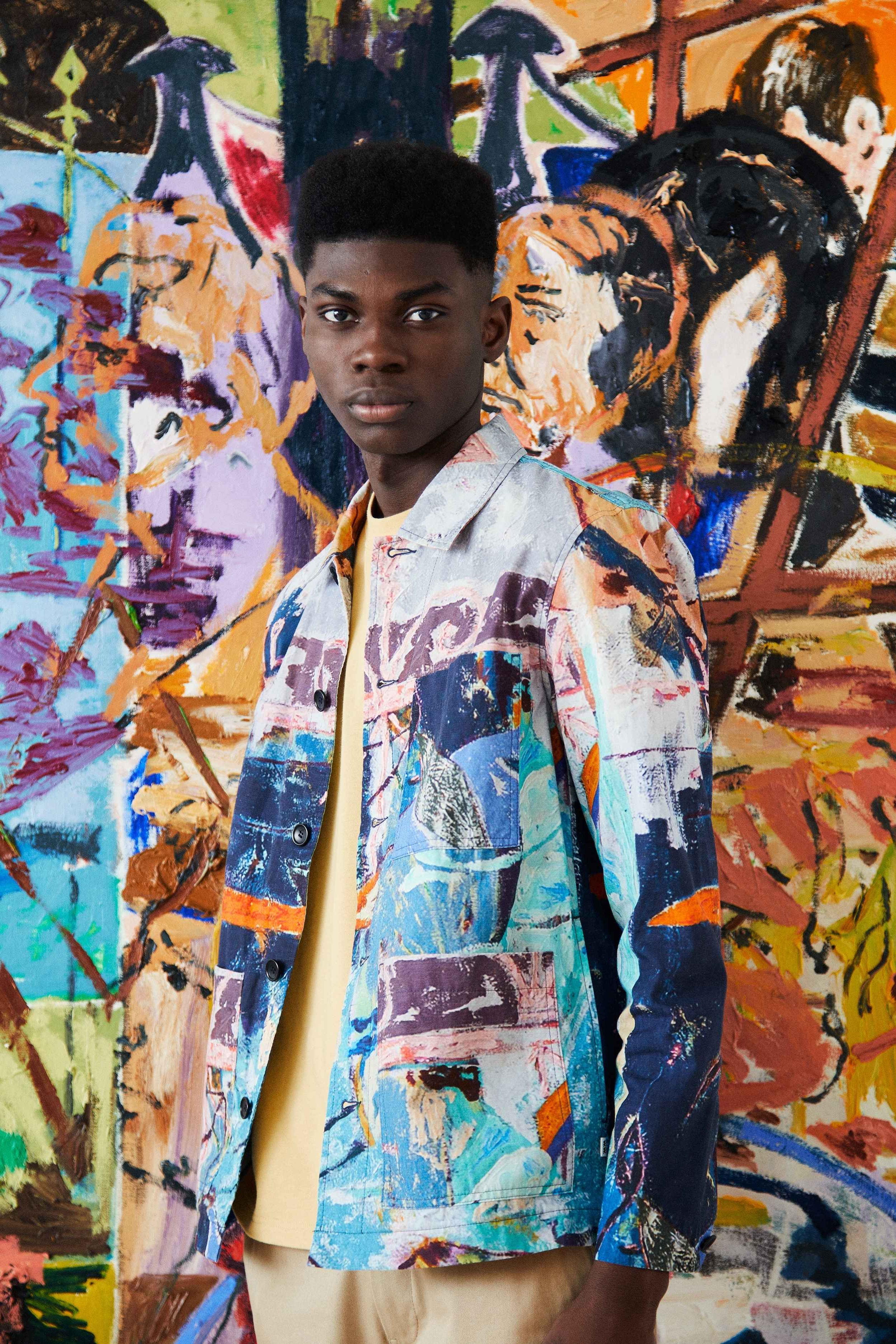
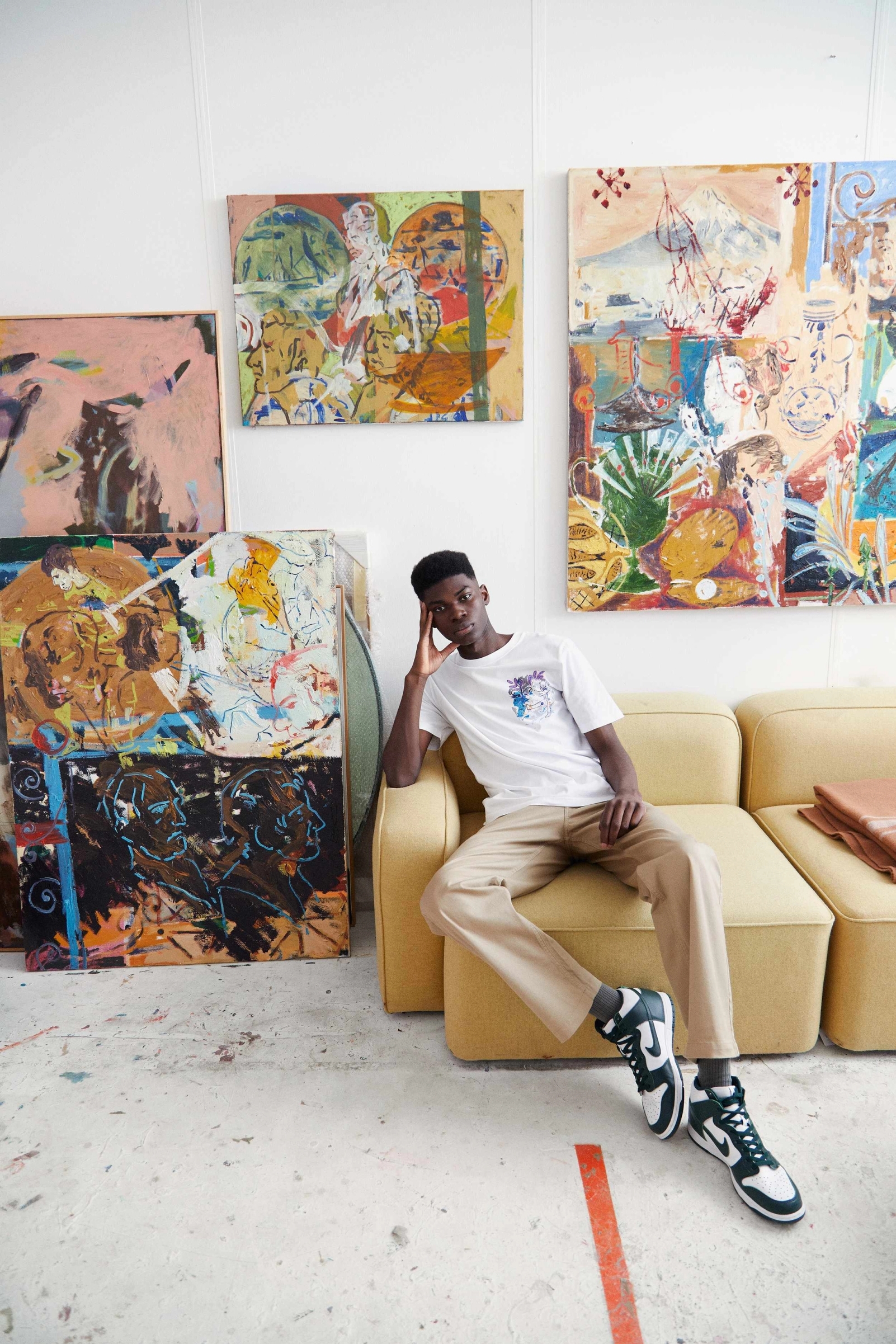
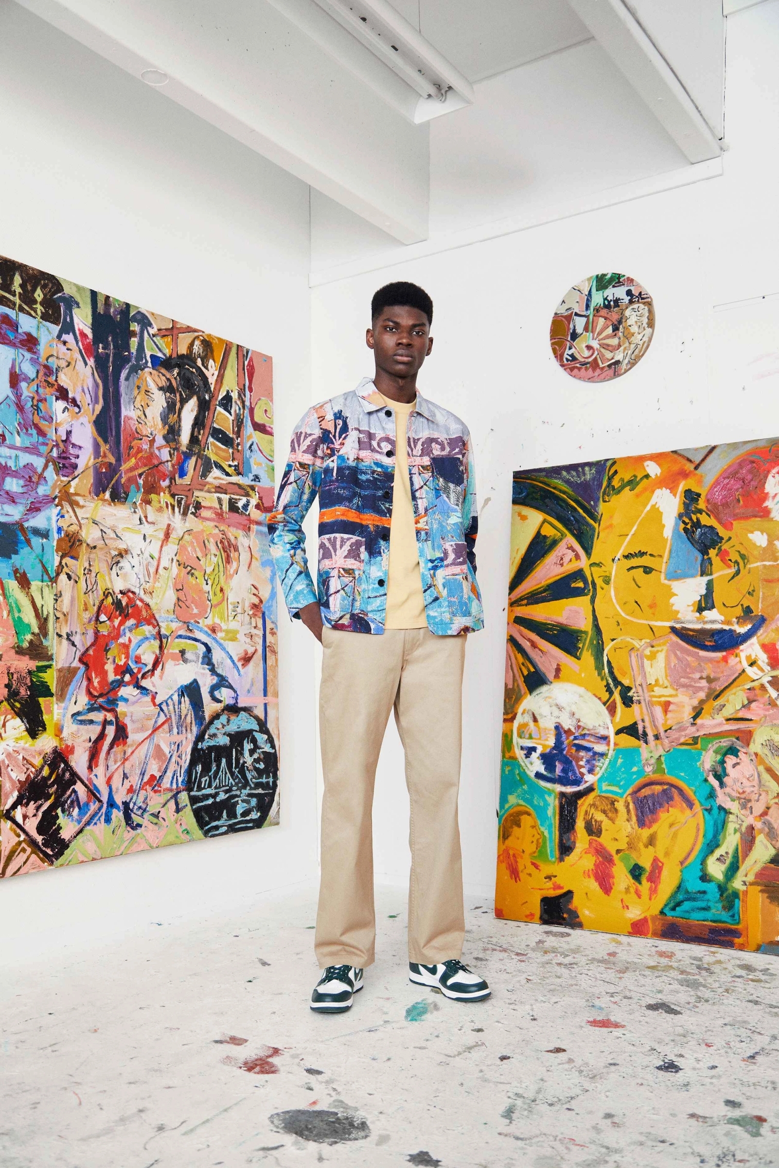
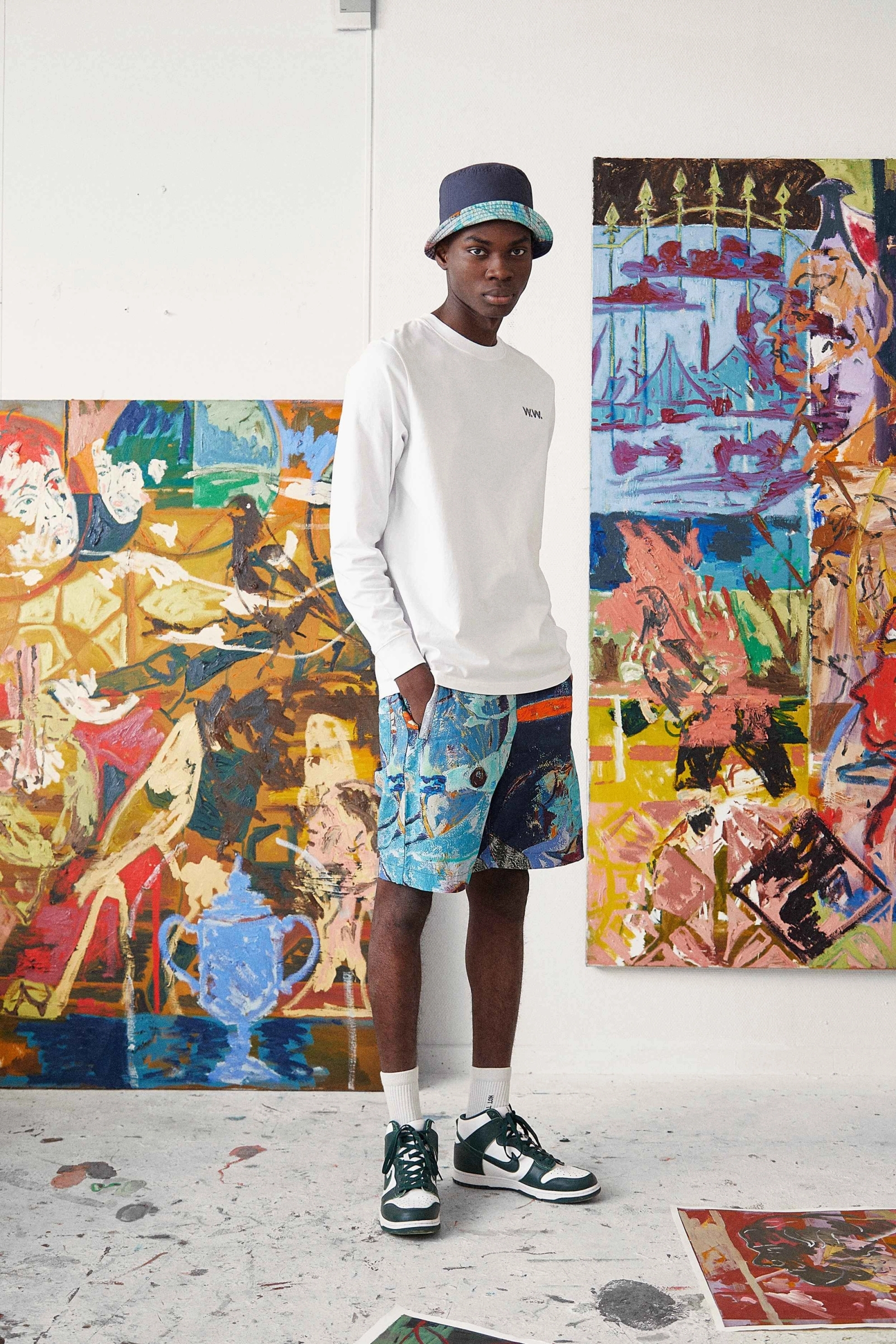
For the Pre-Fall 21, the brand has turned to Jon Pilkington’s visionary talent, granting him the opportunity to see his paintings take on the form of an all-over printed two-piece set, a light lyocell shirt, cotton jerseys, and a reversible bucket hat. Deeply inspired by and permeated with the playfulness and beauty of Napoli’s summer aesthetics, the collection is an ode to natural, truthful, and limitless expression. An idea that Pilkington has perfectly translated onto canvas in each one of his vivid multilayered paintings.
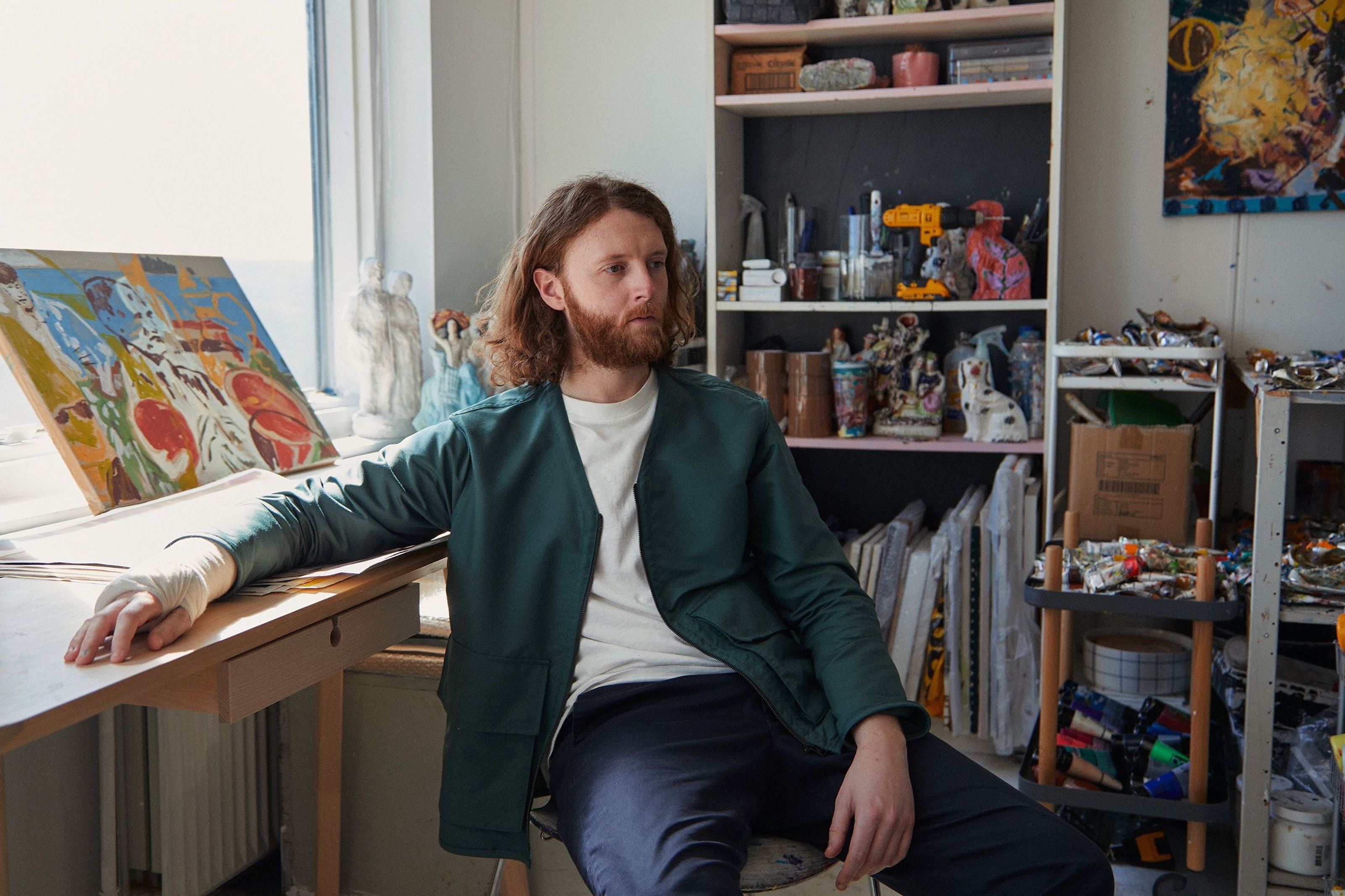
CD: How would you describe your art practice in one sentence?
JP: A lot of laboured decisions, painted quickly.
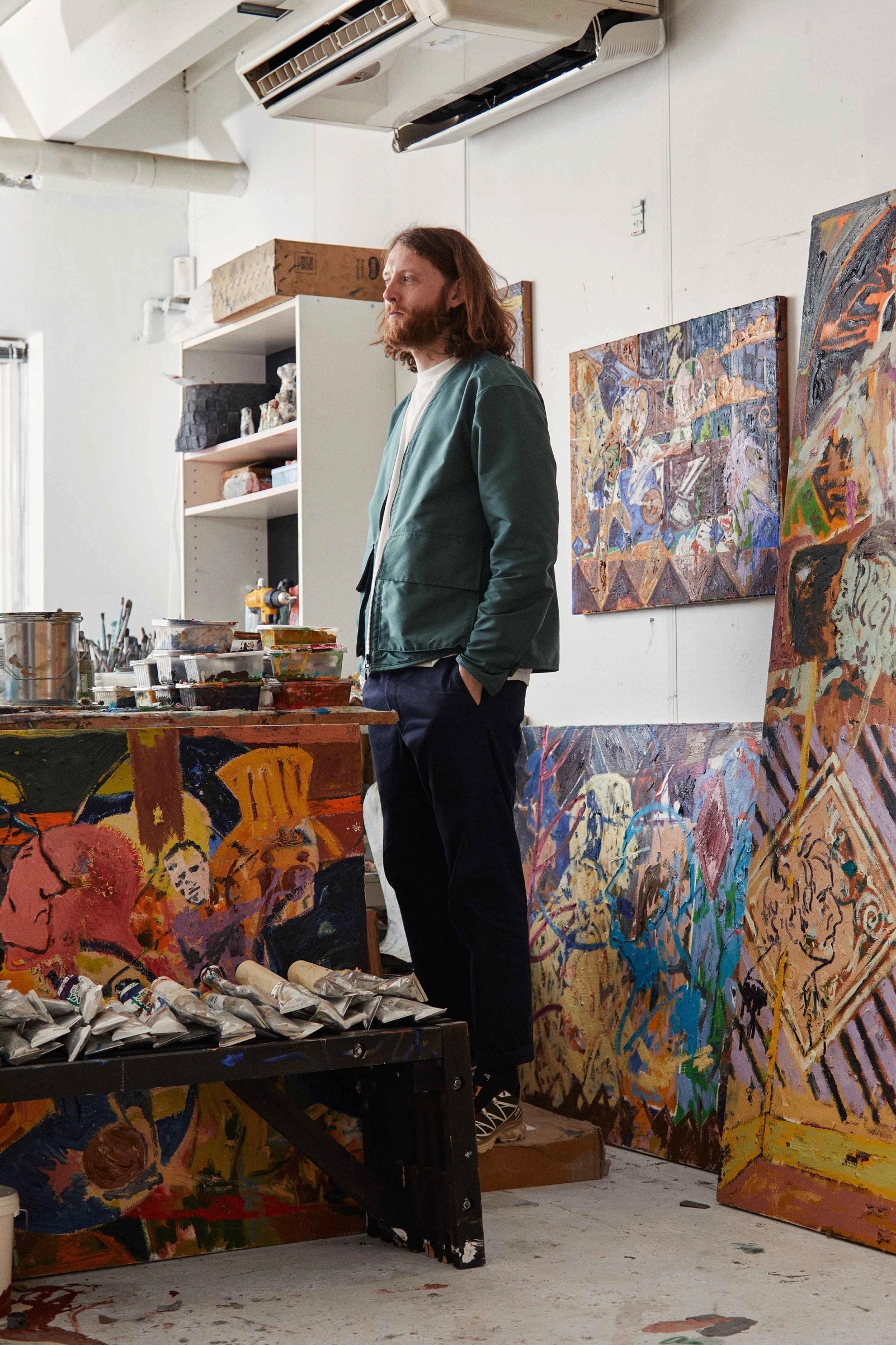
CD: What function does colour play in your artworks? Are colour shades assigned purposefully to each element of the painting, or are those the result of a more instinctive process?
JP: Essentially, I am a colourist. Although it took me a long while to process this, I’m now fully aware that the works function thanks to the sickly juxtaposition of colour pairings. I’m interested in colours that shouldn’t necessarily work together and how this influences the figurative or abstract elements of the painting. I think colour is a way of reading or interpreting in painting; a way in, so to say. Still, for me, it’s always about using palettes that become awkward or uncomfortable. It’s a bit of both, sometimes I start with a very specific limited palette (like I did in the Wood Wood collaboration), and other times colours and hues are born from the process of painting. The constant back and forth can always alter the direction of the palette.